10 Instagram Grid Layouts To Try For Your Feed

Are you looking to level up your Instagram game? Look no further! Instagram has become the ultimate platform for self-expression and visual storytelling, and the arrangement of images on your grid is key to creating a stunning and cohesive feed. Get ready to explore ten unique grid layouts that will take your feed to the next level!
- Checkerboard Chic: This layout features a classic checkerboard pattern, alternating between two different types of images. It’s a visually captivating way to keep your followers engaged and intrigued.
- Colorful Collage: Unleash your creativity with a colorful collage layout. Mix and match vibrant images to create a kaleidoscope of colors that will leave your followers in awe.
- Minimalist Monochrome: Embrace simplicity with a minimalist monochrome grid. Stick to a single color or grayscale palette for a clean and sophisticated aesthetic.
- Puzzle Piece Pizzazz: Give your feed a playful twist with a puzzle-piece layout. Divide your images into unique shapes and watch as they come together like a jigsaw puzzle, creating a captivating visual narrative.
- Diagonal Delight: Add a dynamic touch to your grid with a diagonal layout. Arrange your images in a diagonal pattern, creating an eye-catching flow that will keep your followers scrolling.
- Vertical Vision: Go vertical with a vertical layout to make your feed stand out. Showcase your images in a vertical orientation for a fresh and modern look.
- Mosaic Masterpiece: Create a masterpiece by arranging your images in a mosaic pattern. This layout will add a touch of artistry to your feed and make your images pop.
- Storyline Stunner: Tell a story with your grid by adopting a storyline layout. Arrange your images in chronological order, allowing your followers to follow along with your visual narrative.
- Grid within a Grid: Get creative with a grid within a grid layout. Divide your images into smaller grids within your primary grid, creating an intriguing and visually complex composition.
- Symmetrical Serenity: Achieve harmony and balance with a symmetrical layout. Arrange your images symmetrically for a calming and visually pleasing feed.
With these 10 Instagram grid layouts, you can transform your feed into a work of art. Experiment with different patterns, colors, and arrangements to curate a visually captivating narrative that will leave your followers wanting more.
So get creative and elevate your Instagram feed to new heights!
Table of Contents
- 1 Checkerboard Layout
- 2 Puzzle Grid Layout
- 3 Color Coordination Layout
- 4 Diagonal Line Layout
- 5 Vertical Split Layout
- 6 Horizontal Split Layout
- 7 Rainbow Grid Layout
- 8 Minimalist Grid Layout
- 9 Collage Grid Layout
- 10 Alternating Pattern Layout
- 11 BONUS
- 12 Frequently Asked Questions
- 12.1 How Many Posts Should I Have in a Checkerboard Layout?
- 12.2 Can I Use Different Shapes for the Puzzle Grid Layout?
- 12.3 What Are Some Tips for Achieving a Balanced Color Coordination Layout?
- 12.4 How Can I Create a Diagonal Line Layout Without Using a Grid Planning App?
- 12.5 Are There Any Recommended Photo Editing Apps for Creating a Collage Grid Layout?
Checkerboard Layout
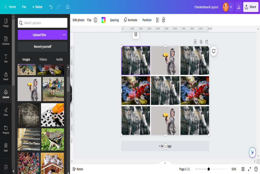
The checkerboard layout is a popular grid design on Instagram, where alternating photos or videos of similar subjects or color schemes are arranged in a checkered pattern. This creative photo grid idea offers your Instagram feed an aesthetically pleasing and organized look. The checkerboard pattern creates visual interest and allows for unique storytelling through images.
Implementing the checkerboard layout requires careful planning and consideration of the content you want to showcase. Selecting photos or videos with similar subject matter, color palette, or style is essential. For example, you can alternate between landscape and portrait-oriented images, pictures with similar dominant colors, or shots with consistent themes such as nature, food, or fashion.
By using the checkerboard pattern effectively, you can create a visually captivating feed that engages your audience. The repetitive nature of this layout enables viewers to anticipate the following image while appreciating the overall coherence and balance of your content. Additionally, it encourages creativity in capturing and curating images that complement each other within the grid.
Puzzle Grid Layout
This discussion focuses on the unique puzzle arrangement and its role in visual storytelling.
Puzzle grids offer a creative way to arrange content, allowing for a visually engaging presentation that captures the viewer’s attention.
Unique Puzzle Arrangement
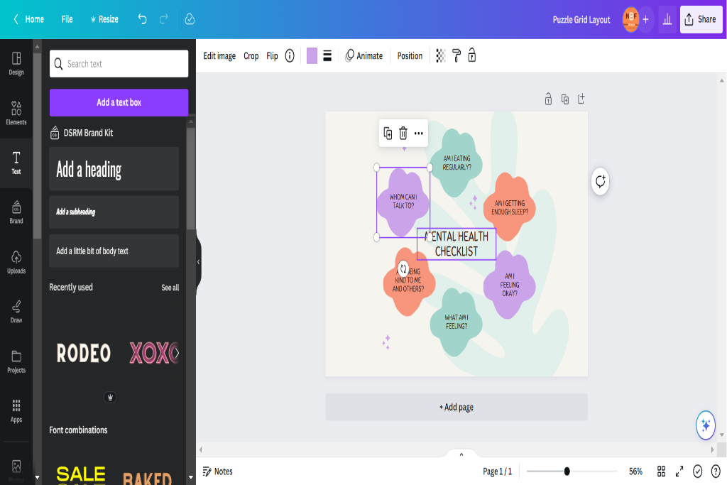
One possible arrangement for an Instagram grid layout is a unique puzzle-like configuration. This creative photo mosaic style involves dividing the grid into multiple sections and arranging photos to create an overall cohesive image when viewed as a whole. The key to such arrangements lies in careful planning and attention to detail.
Here are four important considerations for creating unique puzzle arrangements:
- Image selection: Choose photos that complement each other visually and thematically.
- Grid structure: Experiment with different grid structures, such as squares, rectangles, or irregular shapes.
- Color coordination: Coordinate colors across different images to enhance visual impact.
- Balance and symmetry: Maintain balance and symmetry within each grid section to ensure a harmonious composition.
Visual Storytelling Through Puzzles
Visual storytelling through puzzles involves using a unique arrangement of photos in a grid structure to create a cohesive and visually captivating narrative.
This technique utilizes the grid layout of an Instagram feed to tell a story or convey a specific theme or message. Visual storytelling techniques can engage viewers and effectively communicate ideas by strategically arranging and organizing photos.
Creative photo arrangements within the grid allow for experimentation with various compositions, colors, and subject matter, allowing storytellers to express their creativity and create visually compelling narratives.
Whether through sequential images that depict a chronological story or carefully curated visuals that evoke emotions or convey concepts, visual storytelling through puzzles offers an innovative approach to engaging audiences on social media platforms like Instagram.
Color Coordination Layout
The Color Coordination Layout is popular among Instagram users for creating visually appealing and cohesive feeds. This layout organizes posts based on their color palette, creating a visually harmonious and aesthetically pleasing grid.
To effectively execute the Color Coordination Layout, here are four key considerations:
- Color Palette Selection: Select a color palette that suits your desired aesthetic. This could be monochromatic, complementary, or analogous colors. Consistency in the color scheme ensures a cohesive visual experience for your audience.
- Planning: Before posting, plan the arrangement of your posts to create an engaging visual flow. Consider alternating colors or creating patterns within your grid to maintain interest and balance.
- Consistent Editing: Apply consistent editing techniques to achieve a uniform look across all posts. Adjust brightness, contrast, and saturation levels to ensure each post complements the overall color palette.
- Strategic Placement: Arrange posts strategically to maximize impact. Place bold or vibrant images strategically throughout the grid to create focal points and draw attention.
Diagonal Line Layout
Diagonal Line Layout is a commonly used arrangement technique on social media platforms, characterized by deliberately placing posts in a diagonal pattern to create a visually dynamic and engaging grid. This composition technique strategically positions images or content along diagonal lines to add depth and interest to the overall layout. By utilizing this layout, users can enhance the visual appeal of their social media feeds and attract more attention from viewers.
To better understand how the Diagonal Line Layout works, consider the following example:
| Post 1 | Post 2 | Post 3 |
|---|---|---|
| Image A | Image B | Image C |
| Description | Description | Description |
Each post is arranged diagonally in this table from top left to bottom right. Diagonal lines create a sense of movement and guide the viewer’s eye across the grid. Additionally, incorporating different types of content, such as images and descriptions, further enhances engagement with the layout.
The Diagonal Line Layout effectively showcases creativity and adds visual interest to social media feeds. By skillfully arranging posts in a diagonal pattern, users can create captivating grids that draw viewers’ attention and make their profiles stand out.
Vertical Split Layout
This discussion will focus on the subtopic of dynamic visual storytelling and eye-catching content arrangement.
Dynamic visual storytelling involves using a combination of visuals, such as images, videos, and graphics, to convey a narrative or message effectively.
Eye-catching content arrangement refers to organizing and presenting content visually appealingly that grabs the viewer’s attention.
Both these elements are crucial for creating engaging and impactful visual content that captivates the audience.
Dynamic Visual Storytelling
One effective strategy for creating a visually compelling Instagram feed is employing dynamic visual storytelling techniques. This approach uses creative grid designs to tell a cohesive and engaging story through images.
Here are four ways to incorporate dynamic visual storytelling into your Instagram grid:
- Sequential Storytelling: Arrange your images chronologically to create a narrative unfolding as viewers scroll through your feed.
- Color Palette Storytelling: Curate your grid so that the colors of each image complement one another, creating a harmonious visual experience.
- Theme Storytelling: Choose a specific theme or concept for your feed, such as travel, fashion, or food, and use images related to that theme to convey a consistent message.
- Visual Contrast Storytelling: Play with contrasting elements within your grid layout, such as light and dark imagery or close-ups versus wide shots, to add depth and intrigue to your overall story.
Eye-Catching Content Arrangement
To create an eye-catching arrangement of content, it is essential to organize and sequence the images visually and appealingly strategically. Content organization is vital in capturing viewers’ attention on platforms like Instagram.
One effective way to achieve this is through creative grid designs. These designs allow users to divide their feed into various sections or themes, creating a cohesive and visually pleasing layout. Some popular grid designs include the puzzle layout, checkerboard layout, color scheme layout, and diagonal line layout.
By carefully selecting and arranging images within these grids, individuals can create an aesthetic flow that engages their audience and encourages them to explore further.
Additionally, incorporating consistent branding elements such as color schemes or filters can further enhance the overall visual appeal of the content arrangement.
Horizontal Split Layout
The horizontal split layout is famous for Instagram feeds due to its visually appealing and organized content presentation. This composition technique involves dividing the screen horizontally into two or more sections, allowing for creative image division and showcasing different elements within each section.
Here are four reasons why the horizontal split layout is worth considering for your Instagram feed:
- Visual balance: The horizontal split creates a sense of equilibrium by evenly distributing visual elements across the screen. This balance enhances the overall aesthetic appeal of your feed and ensures that viewers’ attention is not overwhelmed by any single image.
- Storytelling potential: Using multiple sections, you can tell a story or convey a message through sequential images or complementary visuals. This approach allows you to engage your audience and create a cohesive narrative within your grid.
- Highlighting contrasting themes: The horizontal split layout lets you juxtapose contrasting themes, colors, or subjects in adjacent sections. This technique can be particularly effective in creating visual impact and emphasizing image differences.
- Organized presentation: With its structured composition, the horizontal split layout provides an organized framework for displaying various types of content, such as quotes, product showcases, behind-the-scenes shots, or before-and-after transformations.
Incorporating the horizontal split composition into your Instagram feed offers an opportunity to experiment with creative image division while maintaining an aesthetically pleasing and well-organized appearance.
Rainbow Grid Layout
Moving on from the horizontal split layout, the rainbow grid is another visually appealing Instagram grid. This layout involves arranging your photos to create a rainbow color scheme when viewed as a whole. You can create an aesthetically pleasing and cohesive grid by strategically selecting and editing photos with colors that correspond to different parts of the rainbow.
You can employ several photo editing techniques to achieve this effect. Firstly, you can use filters or presets that enhance or alter the colors in your photos to match the desired hues of the rainbow. Adjusting brightness, contrast, and saturation levels can help ensure each photo aligns with the color scheme.
When planning your rainbow grid layout, it is essential to consider the order in which you arrange your photos carefully. You may arrange them based on their dominant color or gradually transition between colors for a more seamless effect. Experimenting with different placements and combinations can help you find your feed’s most visually striking arrangement.
Incorporating a rainbow grid layout into your Instagram feed adds vibrancy and visual interest. Through thoughtful selection and editing of photos using various techniques, you can create an eye-catching display that captivates viewers’ attention.
Minimalist Grid Layout
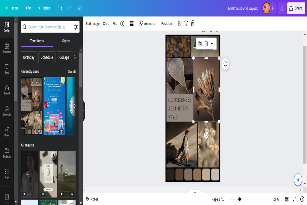
The clean and simple grid layout is a popular design approach emphasizing clarity and organization. This type of layout utilizes a minimalistic aesthetic, emphasizing white space utilization to create a sense of balance and simplicity.
Clean and Simple Grid
A clean and simple grid layout for an Instagram feed can be accomplished using a limited color palette and consistent negative space. A clean and minimalistic design is visually appealing and helps create a cohesive look for your feed.
Here are four grid layout ideas that can help you achieve this aesthetic:
- Symmetry: Arrange your posts symmetrically, such as alternating between images and quotes or using the same filter on every other photo.
- Color coordination: Stick to a specific color scheme or use filters that give your photos a similar tone. This will create harmony and coherence throughout your grid.
- White space: Leave empty spaces between your posts to provide breathing room and highlight individual images.
- Consistency: Use consistent cropping, framing, or editing techniques across your photos to maintain a uniform appearance.
White Space Utilization
Utilizing white space effectively in a grid layout can enhance the visual impact of individual images and create a sense of balance and harmony within the overall composition.
White space, also known as negative space, refers to the empty areas between elements in a design.
Regarding Instagram grid layouts, incorporating strategic white space can help bring attention to specific images or create a clean and minimalist aesthetic.
Leaving empty spaces around specific photos or arranging them with consistent spacing allows each image to stand out and be appreciated.
Using white space in grid layouts also promotes creativity by providing opportunities for unique arrangements and storytelling through visuals.
It encourages designers to think outside the box and experiment with different ways to arrange their content while maintaining an organized structure.
Collage Grid Layout
Collage grid layouts offer a visually appealing way to showcase multiple images within a single post on Instagram. This layout is distinct from the puzzle grid, which divides an image into multiple squares to create a larger picture when viewed as a whole. The collage grid, on the other hand, allows for more creativity by arranging different images in a cohesive and aesthetically pleasing manner.
Here are four key points regarding the creative use of shapes in collage grid layouts:
- Variety: Collage grids allow the mixing of different image sizes and orientations, creating visual interest and diversity within the layout.
- Storytelling: By combining multiple images, collage grids allow users to tell a story or convey a specific theme or message with their posts.
- Composition: Creative use of shapes in collage grids can enhance composition by incorporating geometric patterns or arranging images uniquely that draw attention and engage viewers.
- Cohesion: Despite its flexibility, it is essential to maintain cohesion within the collage grid layout by ensuring that all elements work harmoniously together.
Alternating Pattern Layout
The alternating pattern layout involves arranging images in a repetitive sequence, creating visual interest and rhythm within the composition. This grid layout is characterized by consistently alternating two or more types of images, such as photos and quotes, portraits and landscapes, or color schemes.
The primary advantage of using an alternating pattern for your Instagram feed is the ability to create a cohesive and visually appealing aesthetic. By repeating certain elements predictably, this layout creates a sense of harmony and balance that can be pleasing to the eye.
There are several tips to remember to create a practical alternating pattern layout. First, choose images with complementary colors or themes to enhance visual impact. Secondly, consider incorporating negative space between each image to provide breathing room and prevent overcrowding. Additionally, maintaining image size and orientation consistency can help maintain the rhythmic flow within your feed.
BONUS
Elevate your Instagram feed with OnlySocial’s powerful Image Editing function. Create visually stunning graphics that perfectly align with your brand’s social media presence. Access our array of free stock images and editor, along with free templates. With availability on all plans, OnlySocial is your all-in-one platform for social media growth. Don’t miss out on the opportunity to enhance your visual content. Sign up for a commitment-free 7-day trial today.
Frequently Asked Questions
How Many Posts Should I Have in a Checkerboard Layout?
Maintaining consistency in a checkerboard layout can be achieved by having an equal number of posts in each row and column. The spacing between the posts plays a crucial role in creating the desired visual impact of the checkerboard pattern.
Can I Use Different Shapes for the Puzzle Grid Layout?
Various shapes can be employed in the puzzle grid layout, offering diverse options for creative designs. These alternatives allow users to experiment with patterns and arrangements, creating visually engaging and unique Instagram feeds.
What Are Some Tips for Achieving a Balanced Color Coordination Layout?
Achieving a balanced color coordination layout involves following tips for creating a cohesive aesthetic and utilizing color theory in your Instagram feed. By considering complementary colors, using consistent filters, and maintaining a harmonious color palette, you can create an appealing visual experience for your audience.
How Can I Create a Diagonal Line Layout Without Using a Grid Planning App?
Creating a zigzag line layout without using a grid planning app can be achieved by carefully arranging and aligning your photos in a diagonal pattern. Tips for a seamless diagonal grid include maintaining consistent spacing between images and ensuring the overall composition is visually appealing.
Are There Any Recommended Photo Editing Apps for Creating a Collage Grid Layout?
Adobe Spark is a recommended photo editing app for creating a collage grid layout. It offers various templates and customization options to arrange photos in a grid format. Additionally, it provides tips for achieving visually appealing grid layouts on Instagram.


