How To Make Custom Instagram Highlights Covers
Regarding social media, captivating visuals are key to attracting and engaging users. Instagram is one platform that truly understands this, allowing users to personalize their profiles with eye-catching highlights covers. These custom images serve as visual representations of different sections within your profile.
This article will guide you through creating your unique Instagram highlights covers.
Table of Contents
- 0.1 Step 1: Choose the Right Design Software
- 0.2 Step 2: Select Suitable Images or Icons
- 0.3 Step 3: Add Text and Typography
- 0.4 Step 4: Customize Colors and Backgrounds
- 0.5 Step 5: Size and Format for Instagram
- 0.6 Step 6: Export and Save Your Covers
- 0.7 Step 7: Organize Your Covers on Instagram
- 0.8 Tips and Tricks for Captivating Covers
- 1 Choosing the Right Design Software
- 2 Selecting the Perfect Image or Icon
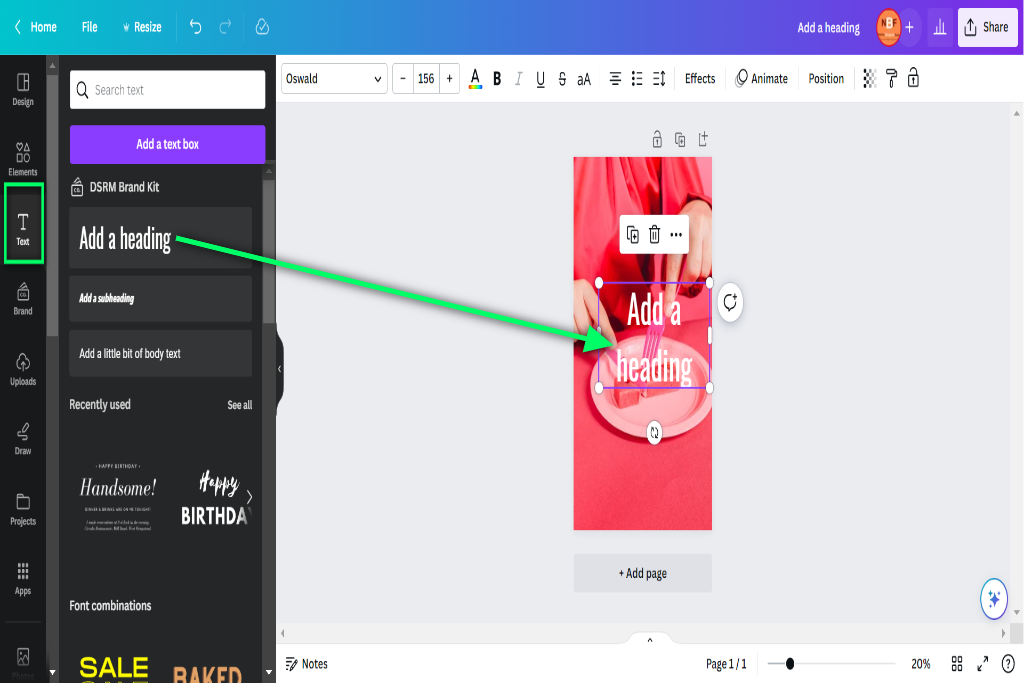
- 3 Adding Text and Typography
- 4 Customizing Colors and Backgrounds
- 5 Sizing and Formatting for Instagram Highlights
- 6 Exporting and Saving Your Covers
- 7 Uploading and Organizing Your Covers on Instagram
- 8 Tips and Tricks for Creating Eye-Catching Highlights Covers
- 9 BONUS
- 10 Frequently Asked Questions
- 10.1 Can I Use Any Design Software to Create Instagram Highlights Covers?
- 10.2 What’s the Ideal Size for Instagram Highlights Covers?
- 10.3 Can I Use Copyrighted Images or Icons for My Highlights Covers?
- 10.4 How Can I Ensure That My Text Is Easily Readable on the Covers?
- 10.5 Are Any Restrictions on the Number of Covers I Can Upload on Instagram?
Step 1: Choose the Right Design Software
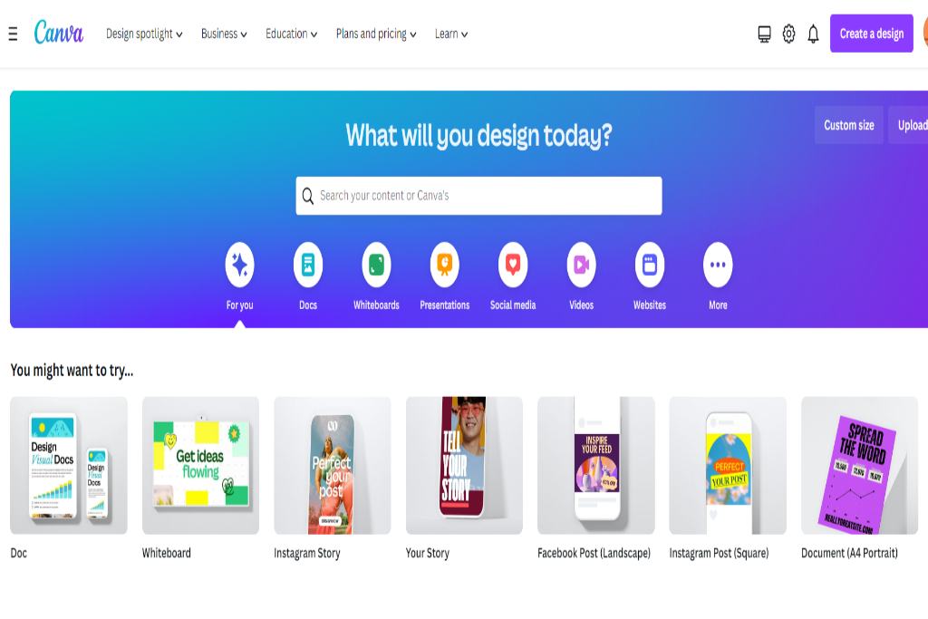
You must select design software that suits your needs and skills to get started. Popular options include Adobe Photoshop, Canva, or free alternatives like GIMP or Pixlr. Find a program that you feel comfortable using and offers the tools necessary to create stunning visuals.
Step 2: Select Suitable Images or Icons
Next, it’s time to choose the images or icons that will make up your highlights covers. These should align with the content or themes of the sections they represent. Aim for images that are visually appealing and easily recognizable. You can create your graphics or explore stock photo websites for suitable options.
Step 3: Add Text and Typography
To make your covers more informative, consider adding text or typography. This can help users quickly understand the purpose of each section. Choose fonts that are easy to read and complement the overall aesthetic. Experiment with different text placements, sizes, and styles to find what works best for you.
Step 4: Customize Colors and Backgrounds
It’s time to infuse your style into the covers by customizing colors and backgrounds. Consider your overall branding or the desired mood you want to convey. Harmonize the colors with your existing profile aesthetic, or experiment with new color schemes to create a visually cohesive look.
Step 5: Size and Format for Instagram
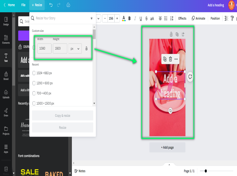
To ensure optimal display on Instagram, it’s important to size and format your covers correctly. Instagram highlights covers are displayed in circles, so keep this shape in mind when designing. Aim for a resolution of 1080×1080 pixels to maintain image quality. Save your covers in a compatible format, such as JPEG or PNG, for easy upload.
Step 6: Export and Save Your Covers
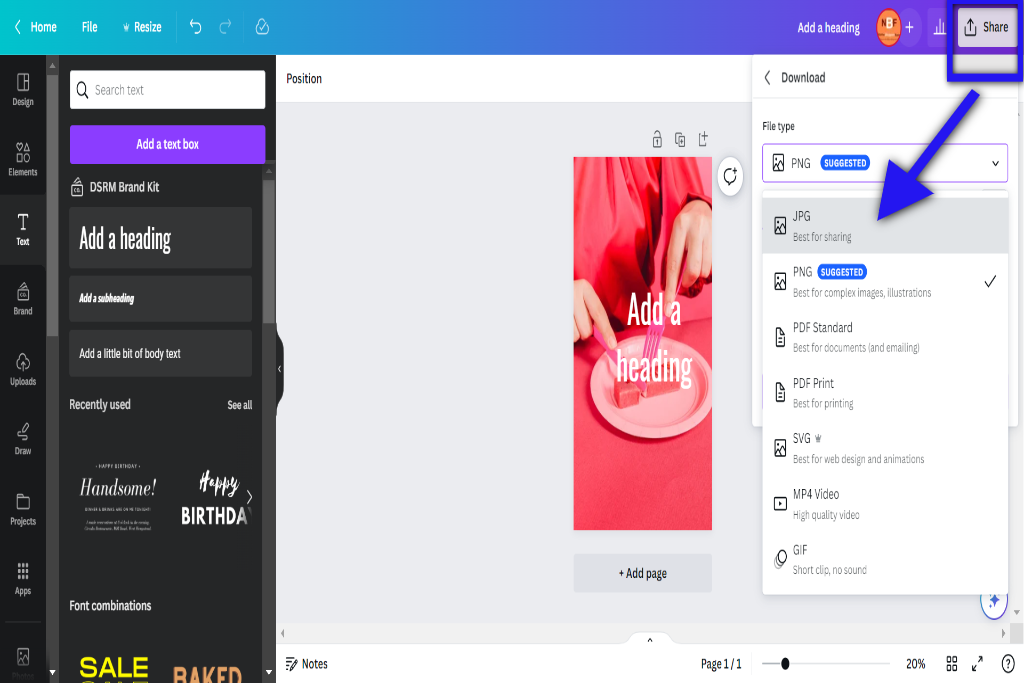
Once you’re satisfied with your covers, export and save them to your device. This will allow you to quickly access and upload them to Instagram when organizing your highlights later. Create a separate folder to keep them organized and readily available whenever you need to make changes or additions.
Step 7: Organize Your Covers on Instagram
Now that your covers are ready, it’s time to organize them on your Instagram profile. Open the Instagram app, go to your profile, and tap the ‘Edit Highlight’ button. From there, you can select the desired covers from your device and assign them to specific highlights. Arrange them in a visually appealing order that aligns with your profile’s overall aesthetic.
Tips and Tricks for Captivating Covers
- Keep your covers consistent in style and color to maintain a cohesive look.
- Use eye-catching imagery that accurately represents the content of each section.
- Experiment with different design elements to create unique and visually appealing covers.
- Regularly update and refresh your covers to keep your profile engaging and up-to-date.
- Don’t be afraid to get creative and showcase your personality through your covers.
By following these steps and incorporating your creativity, you can create custom Instagram highlight covers to capture attention and enhance your profile’s visual appeal. So, get started and let your imagination run wild!
Choosing the Right Design Software
The selection of appropriate design software is crucial when considering how to create custom Instagram highlight covers. Design software is fundamental in creating, allowing users to manipulate images, add text and graphics, and enhance their overall visual appeal. To make an informed decision about which design software to use, it is essential to compare available options thoroughly.
Several design software programs are available in the market that cater specifically to graphic design needs. Adobe Photoshop and Canva are popular choices for creating Instagram highlight covers. While Photoshop offers advanced editing capabilities, Canva provides a user-friendly interface with pre-designed templates and drag-and-drop functionality.
Numerous tutorials are available online to assist users in navigating these design tools effectively. These tutorials provide step-by-step instructions on using various features and techniques within the software. They offer valuable guidance on creating visually appealing designs for Instagram highlight covers.
When comparing different design software options, it is important to consider factors such as ease of use, available features, flexibility, cost, and compatibility with different devices or operating systems. By evaluating these aspects and utilizing online tutorials as learning resources, individuals can select the most suitable design software for their specific requirements when creating custom Instagram highlight covers.
Selecting the Perfect Image or Icon
This discussion will focus on the key points of Image vs. Icon, Color and Style, and Relevance and Consistency when selecting the perfect image or icon for design purposes.
When choosing between an image or an icon, it is important to consider their respective advantages and disadvantages regarding visual impact and message conveyance.
Color and style capture attention and create a cohesive design aesthetic.
Relevance and consistency ensure that the chosen visuals align with the overall theme or objective of the design project.
Image Vs. Icon
When comparing image design and icon selection, it is important to consider their respective visual characteristics and purposes.
An image represents or depicts something, typically created through photography or digital art. It can be complex and detailed, conveying multiple layers of meaning. Image design involves careful composition, color palette, and overall aesthetic arrangement of elements within an image to create a visually appealing and cohesive result.
On the other hand, an icon is a simplified symbol representing an object, concept, or action in a graphical form. Icons are typically simple and easily recognizable, often used for navigation or as visual indicators in user interfaces. Icon selection involves choosing clear, concise, and visually consistent icons with the overall design language employed.
Both images and icons have unique uses and advantages in visual communication depending on the context and intended purpose.
Color and Style
Color and style play a significant role in image design and icon selection. They contribute to the overall aesthetic appeal and visual consistency of the composition. Color psychology can evoke specific emotions or convey particular messages to the audience. Design inspiration can be drawn from various sources, such as nature, art movements, or cultural symbols.
When considering color and style for image design and icon selection, it is important to consider factors like contrast, harmony, and balance. Here are five elements to consider:
- Color palette: Select a cohesive color scheme that complements the overall theme.
- Typography: Choosing fonts that align with the desired aesthetic and enhance readability.
- Shapes: Incorporating different shapes to create visual interest and convey meaning.
- Texture: Adding textures to provide depth and tactile qualities to the composition.
- Composition layout: Arranging elements in a balanced manner that guides the viewer’s eye.
Relevance and Consistency
Relevance and consistency are crucial in image design and icon selection as they contribute to visual communication’s overall coherence and effectiveness. When creating custom Instagram highlight covers, it is important to ensure that the chosen images or icons are relevant to the content they represent. This enhances user understanding and engagement with the profile. Consistency in design elements such as color scheme, style, and typography helps establish a cohesive visual identity for branding. Aesthetically pleasing covers that align with the overall brand image create a professional and polished appearance. To illustrate this point further, consider the following table, which showcases different examples of relevance and consistency in Instagram highlights covers:
| Relevance | Consistency |
|---|---|
| Food | Color scheme |
| Travel | Typography |
| Fitness | Style |
Adding Text and Typography
Typography is crucial in enhancing the visual appeal and conveying the intended message on custom Instagram highlight covers. When adding text to these covers, it is important to consider typography tips and placement.
Here are five key considerations:
- Font Choice: The right font is essential for creating an impactful design. Choose fonts that align with your brand’s personality and complement the overall aesthetic of your Instagram profile.
- Readability: Ensure the text is easily readable, even when viewed on small screens. Opt for fonts with good legibility and avoid using overly decorative or complex typefaces.
- Contrast: Create a contrast between the background and text colors to make the text stand out. This will help grab attention and make your highlights covers visually appealing.
- Alignment: Proper text alignment can significantly improve the overall visual balance of your highlights covers. Experiment with center-aligned, left-aligned, or right-aligned text to find what works best for your design.
- Hierarchy: Use different font sizes, weights, or styles to establish a hierarchy within your design. This will guide viewers through the information hierarchy and effectively emphasize key messages.
Customizing Colors and Backgrounds
When customizing colors for your designs, it is important to consider color theory and its impact on visual perception. Color selection tips can help you create harmonious and visually appealing compositions by understanding the principles of color harmony, contrast, and psychology.
Additionally, background design ideas are crucial in enhancing your design’s overall aesthetic, whether through minimalist or intricate patterns, gradients, textures, or images. You can create engaging visuals that communicate your message by exploring color combinations and background options.
Color Selection Tips
Color selection is crucial in designing custom Instagram highlight covers, influencing the overall aesthetic appeal and brand consistency. When choosing colors for Instagram highlights covers, it is important to consider color psychology and how different colors evoke certain emotions and associations. The color selection should also align with the branding strategy to maintain a cohesive visual identity.
Here are some tips for selecting colors for custom Instagram highlight covers:
- Choose colors that reflect the brand’s personality and values.
- Consider the target audience and their preferences.
- Use contrasting colors to make the icons stand out.
- Ensure legibility by using high contrast between text and background.
- Experiment with different color combinations to find what works best.
Background Design Ideas
The background design is integral to creating visually appealing and aesthetically pleasing Instagram highlight covers. One important consideration when designing the background is selecting a suitable color scheme. Choosing complementary colors or monochromatic tones can create a harmonious and balanced look. It’s also essential to consider the overall theme or mood you want to convey through your highlights covers.
For example, warm colors like reds, oranges, and yellows can evoke a sense of energy and excitement, while cooler tones like blues and greens can create a more calming and soothing atmosphere.
Incorporating patterns into the background design can add visual interest and depth to your Instagram highlights covers. Geometric patterns such as stripes or chevrons can give a modern and clean look, while floral or nature-inspired patterns can bring a touch of elegance and whimsy. Additionally, abstract or artistic patterns can help showcase your creativity.
Overall, carefully selecting background color schemes and incorporating patterns is essential in designing captivating Instagram highlight covers that reflect your style and capture viewers’ attention.
Sizing and Formatting for Instagram Highlights
Adhering to the recommended sizing and formatting guidelines for Instagram highlights covers is essential to ensure optimal display and alignment. Instagram highlights covers are a great way to showcase your brand or content on your profile page. When creating custom covers, it is important to consider the image dimensions and file formats that work best for this purpose.
Here are some key factors to keep in mind when determining the sizing and formatting for Instagram highlights covers:
- Image Dimensions: The ideal size for an Instagram highlight cover is 1080 by 1920 pixels. This ensures the cover fits perfectly within the circular frame without distortion or cropping.
- File Formats: JPEG or PNG formats are commonly used for Instagram highlight covers. Both formats provide good image quality while keeping file sizes manageable.
- Aspect Ratio: Maintaining a 9:16 aspect ratio when designing your highlight cover images is essential. This ensures that they appear correctly on both mobile devices and desktop screens.
- Consistency: To create a cohesive look, it is advisable to use consistent colors, fonts, and themes across your highlight covers. This helps with branding and makes your profile more visually appealing.
- Quality: Ensure you use high-resolution images for your highlight covers to maintain clarity and sharpness even when viewed on larger screens.
Exporting and Saving Your Covers
After sizing and formatting your Instagram highlights covers, the next step is to export and save them. This ensures that your covers are ready to be uploaded onto your Instagram profile. Exporting and saving covers can be done using various software applications, such as Photoshop or Canva. These programs allow you to create high-quality images in the required dimensions for Instagram highlights.
To save your covers, follow these steps:
- Select the “Export” option from the file menu.
- Choose your covers’ desired file format (e.g., JPEG or PNG).
- Specify the location on your computer where you want to save the files.
- Name each cover appropriately to identify them later quickly.
Additionally, it is important to consider the resolution of your exported covers. Aim for a resolution of 72 pixels per inch (PPI) to ensure optimal display on mobile devices.
Table: Steps for Exporting and Saving Covers
| Step | Actions |
|---|---|
| 1 | Select the “Export” option from the file menu |
| 2 | Choose the desired file format (e.g., JPEG or PNG) |
| 3 | Specify the location on the computer to save files |
| 4 | Name each cover appropriately |
Uploading and Organizing Your Covers on Instagram
When uploading and organizing your covers on Instagram, it is important to consider the order in which you want them to appear on your profile page. Here are some tips and strategies to help you upload and organize your covers effectively:
- Plan a cohesive theme: Decide on a consistent theme or aesthetic for your covers that aligns with your brand or style.
- Choose high-quality images: Select visually appealing and high-resolution images representing each highlight category’s content.
- Maintain consistency: Use similar colors, fonts, or design elements throughout all your covers to create a cohesive look.
- Consider relevance: Arrange the covers in an order that makes sense for your audience. Place more frequently accessed categories at the beginning.
- Regularly update: As you create new content or launch new categories, update and replace older covers accordingly.
By following these uploading tips and organizing strategies, you can create an aesthetically pleasing profile page that engages your followers while effectively showcasing the different highlights of your Instagram account.
Regularly review and refine your cover arrangements to keep them relevant and engaging for your audience.
Tips and Tricks for Creating Eye-Catching Highlights Covers
A key factor in designing visually captivating highlight covers is the careful selection of images that effectively represent the content of each category. However, another crucial aspect is the font choice for the text displayed on these covers. The font used can significantly impact the overall aesthetic and appeal of the highlight covers.
When choosing a font for your Instagram highlights covers, selecting one that aligns with your brand or personal style is essential. Consider factors like readability, legibility, and compatibility with different devices and screen sizes. Sans-serif fonts are often preferred due to their clean and modern appearance.
In addition to selecting an appropriate font, utilizing negative space can enhance the visual appeal of your highlight covers. Negative space refers to the empty areas surrounding objects or text in a design. By strategically incorporating negative space, you can create a more balanced composition and draw attention to key elements.
To effectively utilize negative space, experiment with different layouts and arrangements of images and text on your highlight covers. Keep in mind that simplicity often reigns supreme when it comes to creating visually appealing designs.
BONUS
Enhance your Instagram profile with OnlySocial’s powerful Image Editing function. Create stunning graphics and custom covers for your Instagram highlights that perfectly align with your brand’s social media presence. Access our collection of free stock images, editor, and various free templates. OnlySocial is your all-in-one platform for social media growth, available on all plans. Don’t miss out on the opportunity to elevate your visual content. Sign up for a commitment-free 7-day trial today.
Frequently Asked Questions
Can I Use Any Design Software to Create Instagram Highlights Covers?
Design software options can be used to create Instagram highlight covers, providing various tools and features for customization. However, alternative cover design methods, such as graphic editing platforms or online templates, are viable options for achieving desired results.
What’s the Ideal Size for Instagram Highlights Covers?
The ideal dimensions for Instagram highlights covers vary, but a recommended resolution is 1080 by 1920 pixels. This size ensures optimal display on mobile devices and maintains image quality.
Can I Use Copyrighted Images or Icons for My Highlights Covers?
Licensed images or icons for Instagram highlight covers are recommended to avoid copyright infringement. Alternatives to copyrighted images include using royalty-free stock photos, creating your original designs, or obtaining permission from the copyright holder.
How Can I Ensure That My Text Is Easily Readable on the Covers?
When designing highlight covers, it is important to consider the readability of the text. Choose a clear and legible font with the appropriate size and style for the covers to ensure ease of reading.
Are Any Restrictions on the Number of Covers I Can Upload on Instagram?
The number of covers that can be uploaded on Instagram is subject to limitations and upload restrictions. Understanding these constraints is crucial for users wishing to optimize their use of highlight covers on the platform.


