How To Make Custom Instagram Highlights Covers
Custom Highlight covers are the way to go if you want to add a personal touch to your Instagram profile. These covers represent your curated collections, making your profile more aesthetically appealing and easy to navigate.
Follow these simple steps to craft your own unique Instagram Highlights covers:
- Get Design Software: Design software that suits your preferences and skill level. Programs like Canva or Adobe Photoshop offer user-friendly interfaces and various design tools.
- Choose Icons or Images: Select icons or images that best represent each of your curated collections. Aim for clarity and relevance, ensuring that the chosen visuals correlate with the content featured in your Highlights.
- Pick Color Schemes: Opt for color schemes that harmonize with your Instagram theme. Consistency is key, so stick to a palette or complementary colors that reflect your brand.
- Add Text or Labels: Enhance the clarity of your covers by including text or labels. Use concise and descriptive wording to indicate the topic or theme of each Highlight. Avoid cluttering the covers with excessive text – simplicity is key.
- Format the Covers: Ensure your covers are visually appealing by formatting them correctly. Pay attention to alignment, spacing, and proportions, creating a cohesive look across all your Highlights.
- Organize and Arrange Highlights: Strategically arrange your Highlights to create a logical flow and make it easier for your followers to navigate your content. Consider the order in which you want your curated collections to appear, placing the most important ones first.
- Customize Covers for Different Categories: If you have a variety of content categories, consider creating different sets of covers that represent each one. This adds visual distinction and makes locating specific content more straightforward for your followers.
- Refresh Periodically: Keep your profile fresh and engaging by periodically updating your covers. This allows you to incorporate new design elements or reflect changes in your content, keeping your profile visually exciting and current.
By following these step-by-step guidelines, you can create custom Instagram highlight covers that reflect your unique style and enhance the overall aesthetic appeal of your profile. Start designing today and make your Instagram Highlights genuinely stand out!
Table of Contents
- 1 Choosing the Right Design Software
- 2 Selecting the Perfect Icon or Image
- 3 Deciding on a Color Scheme
- 4 Adding Text or Labels
- 5 Sizing and Formatting the Covers
- 6 Exporting the Covers as Images
- 7 Uploading the Covers to Your Instagram Highlights
- 8 Organizing and Arranging the Highlights
- 9 Customizing the Highlight Covers for Different Categories
- 10 Updating and Refreshing Your Highlight Covers
- 11 BONUS
- 12 Frequently Asked Questions
- 12.1 How Do I Create Custom Instagram Highlight Covers Without Any Design Software?
- 12.2 Can I Use Copyrighted Images or Icons for My Highlight Covers?
- 12.3 How Can I Make My Highlight Covers Stand Out From Others on Instagram?
- 12.4 Is There a Maximum Number of Highlights I Can Have on My Instagram Profile?
- 12.5 Can I Change the Order of My Highlight Covers Once I’ve Uploaded Them to Instagram?
Choosing the Right Design Software
Selecting an appropriate design software is crucial when creating custom Instagram highlight covers. Design software comparison is essential to identify the best tools for beginners. Various design software options cater to different skill levels when designing visually appealing highlight covers.
For beginners, it is important to choose user-friendly and intuitive design software. Canva and Adobe Spark are popular for beginners due to their simple interface and pre-designed templates. These tools provide various customization options, allowing users to create unique, eye-catching designs without extensive experience.
On the other hand, more advanced designers may prefer software like Adobe Photoshop or Illustrator for their flexibility and extensive features. While these programs require a steeper learning curve, they offer unparalleled control over design elements and allow for more intricate customization.
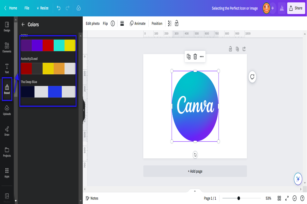
Selecting the Perfect Icon or Image
![]()
To select the perfect icon or image for your Instagram highlights covers, consider factors such as visual appeal, relevance to the content, and consistency with your branding. Making thoughtful choices in icon selection and image customization can enhance the overall aesthetic of your profile and attract more followers.
Here are four key considerations when selecting icons or images for your Instagram highlights covers:
- Visual Appeal: Choose icons or images that are visually appealing and eye-catching. Consider using high-quality graphics with clear lines and vibrant colors to make them stand out on your profile.
- Relevance to Content: Ensure that the icons or images you select accurately represent the content of your highlights. For example, if you have a food blog, use food-related images like a fork and knife or a chef’s hat to indicate culinary content.
- Consistency with Branding: Maintain consistency using icons or images that align with your brand identity. Incorporate elements from your brand logo, color scheme, or typography into the design of your covers.
- Balance Variety and Coherence: Strike a balance between variety and coherence in selecting icons or images for each highlight category. While it’s important to have diversity among cover designs, ensuring there is some visual coherence will create a cohesive look for your profile.
Deciding on a Color Scheme
When deciding on a color scheme for icons or images, it is important to consider factors such as visual harmony, brand identity, and audience appeal. Color palettes are crucial in visual branding as they contribute to a brand’s overall aesthetic and recognition. Using consistent colors throughout your icons or images can create a cohesive, visually appealing look that aligns with your brand’s identity.
To choose an appropriate color scheme, it is helpful to understand the psychology of colors. Different colors evoke different emotions and have varying effects on individuals. For instance, warm colors like red and orange can convey energy and excitement, while cool colors like blue and green can promote calmness and relaxation. By understanding how your target audience perceives different colors, you can select a color palette that resonates with them.
Incorporating contrasting colors in your icons or images can create visual interest and make certain elements stand out. Using complementary color combinations (colors opposite each other on the color wheel) or analogous color combinations (colors next to each other on the color wheel) can enhance the overall impact of your visuals.
Consider creating a mood board or using online tools to explore various color palettes before deciding. This will ensure that you choose a color scheme that reflects your brand’s personality and appeals to your target audience.
| Color Palette 1 | Color Palette 2 |
|---|---|
| Primary Color: Blue | Primary Color: Red |
| Secondary Color: Green | Secondary Color: Yellow |
| Tertiary Color: Purple | Tertiary Color: Orange |
| Accent Color: Pink | Accent Color: Gray |
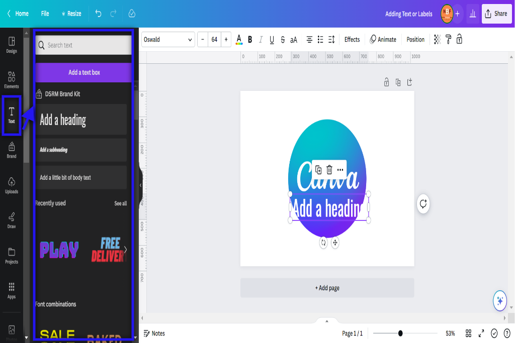
Adding Text or Labels
Labels are crucial in catching viewers’ attention and effectively conveying information.
Designing eye-catching labels requires careful consideration of various elements such as color, shape, and imagery to create a visually appealing composition.
In addition, typography and font choices also play a significant role in enhancing the overall design by conveying the desired tone and message.
Designing Eye-Catching Labels
One practical approach to creating visually captivating labels for custom Instagram highlight covers involves using vibrant colors and complementary typography. This can be achieved by following these steps:
- Customizing label shapes: Experiment with different shapes, such as circles or squares, to add visual interest to your cover labels. Consider using geometric patterns or incorporating unique design elements that reflect your brand identity.
- Incorporating brand elements: To maintain consistency and reinforce your brand image, include elements such as logos, icons, or color schemes that align with your overall branding strategy. This will help viewers instantly recognize and associate your content with your brand.
- Choosing vibrant colors: Opt for bold, eye-catching colors that make your labels stand out in a crowded feed. Use contrasting colors to enhance readability and ensure the text is legible against the background.
- Using complementary typography: Selecting fonts that complement each other can create a harmonious and visually appealing label design. Pair a bold font for important keywords with a more elegant font for additional information or descriptions.
Typography and Font Choices
Typography and font choices are crucial in designing visually appealing labels for Instagram highlights covers. In the design world, typography trends are constantly evolving, with new styles and techniques emerging regularly.
When selecting fonts for Instagram highlights covers, it is important to consider font pairing tips to create a harmonious and balanced composition. One popular trend in typography is using bold and eye-catching fonts that grab attention and make a statement.
Another trend is the combination of contrasting fonts, such as pairing a serif font with a sans-serif font, to create visual interest and hierarchy. Additionally, designers can experiment with different font sizes, weights, and styles to convey moods or themes within their highlight covers.
Sizing and Formatting the Covers
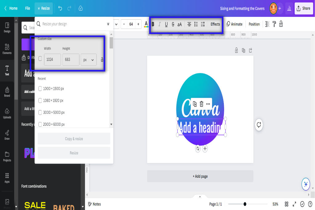
This section will focus on the different aspect ratio options and design and layout options available for customizing Instagram highlight covers.
Aspect ratio options refer to the proportional relationship between the width and height of an image, which can significantly impact its overall appearance when used as a cover.
Design and layout options, on the other hand, involve various techniques and elements that can be utilized to create visually appealing and aesthetically pleasing covers. These include color schemes, typography choices, and the arrangement of images or text.
Understanding these key points will enable users to make informed decisions regarding sizing and formatting their Instagram highlights covers.
Aspect Ratio Options
The aspect ratio options for custom Instagram highlights covers include 1:1, 4:5, 9:16, and other dimensions that can be selected based on the desired visual composition. Each aspect ratio offers distinct advantages and considerations when creating unique designs:
- 1:1 – This square format is ideal for showcasing logos or text-based designs. It provides a balanced and symmetrical look.
- 4:5 – This vertical format works well for portrait-oriented images or close-up shots. It allows for more detail to be displayed on the cover.
- 9:16 – This tall, narrow format displays landscape-oriented images or panoramic shots. It creates an immersive visual experience.
- Other Dimensions – Instagram also allows users to select other custom dimensions that suit their specific design needs, offering flexibility in terms of creativity and expression.
Design and Layout Options
When considering the design and layout options for customizing Instagram highlights covers, selecting dimensions and aspect ratios that align with the desired visual composition is important. Design inspiration plays a crucial role in this process, as it helps guide the creative elements incorporated into the covers.
One option is creating a cohesive theme throughout all covers using consistent colors, fonts, or graphic elements. This can give an aesthetically pleasing and professional look to the highlights section of an Instagram profile.
Another option is to customize each cover, allowing for creativity and uniqueness. In this case, one can experiment with different design styles or incorporate personal photographs or illustrations that reflect their brand or personality.
Ultimately, design and layout options should be based on what best represents the individual’s vision for their Instagram profile while considering usability and visual appeal.
Exporting the Covers as Images
One must follow a series of steps to successfully export the covers as images. Here are four essential steps to consider:
- Please choose the appropriate exporting options: When exporting Instagram highlights covers as images, selecting the correct file format and size is important. Generally, JPEG or PNG formats work well for images on social media platforms like Instagram. Additionally, ensure that the dimensions of your cover image meet Instagram’s requirements to avoid any distortion or cropping.
- Maintain consistency in design: While exporting your covers as images, maintain a consistent design theme throughout all your highlights. This will help create a cohesive and visually appealing aesthetic on your Instagram profile.
- Optimize for mobile viewing: Since most users access Instagram through smartphones, optimizing your cover images for mobile viewing is crucial. Ensure that the text and graphics are clear and legible on smaller screens.
- Seek design inspiration: To enhance the visual appeal of your cover images, seek design inspiration from various sources such as graphic design websites, social media accounts dedicated to aesthetics or color schemes, or even popular influencers’ profiles. This can provide fresh ideas and help you create unique and eye-catching covers.
Uploading the Covers to Your Instagram Highlights
When uploading the covers to your Instagram highlights, choosing the best image format is essential for maintaining the quality and integrity of your designs.
PNG is the most recommended image format for uploading covers on Instagram, as it supports transparency and provides crisp visuals.
Additionally, adding cover descriptions can enhance user experience by providing context and making your highlights more accessible and informative.
Best Image Format
One recommended image format for custom Instagram highlights covers is PNG, which supports transparency and high-quality graphics.
When choosing the best color for your highlight covers, consider the overall aesthetic of your Instagram profile. Opt for colors that align with your brand or personal style and create a cohesive look.
Additionally, optimizing images for Instagram highlights covers ensures they are clear, sharp, and visually appealing. This can be achieved by using high-resolution images and avoiding compression or resizing that may result in loss of quality.
Lastly, it is important to note that Instagram highlights cover images should be sized at 1080 pixels by 1920 pixels to ensure they display correctly on all devices.
Adding Cover Descriptions?
Adding descriptions to cover images can enhance the visual appeal of your Instagram profile and provide context for viewers. When customizing highlight backgrounds, it is important to consider the cover descriptions’ role in conveying information about each Highlight.
A well-written description can give viewers a clear understanding of what content they can expect in the corresponding Highlight, making navigating your profile easier. Moreover, adding cover descriptions adds a layer of personalization and creativity to your profile, allowing you to showcase your unique style and personality.
These descriptions should be concise yet descriptive, capturing the essence of each Highlight without overwhelming the viewer with excessive details. By carefully crafting cover descriptions, you can create an engaging and visually appealing Instagram profile that leaves a lasting impression on your audience.
Organizing and Arranging the Highlights
To efficiently organize and arrange the highlights on Instagram, one can categorize them based on specific themes or topics. This gives users a cohesive and visually appealing look to their profile. Here are four ways to effectively arrange your content:
- Choose a theme: Decide on an overarching theme for your highlights, such as travel, food, or fashion. This will help create consistency and make it easier for viewers to navigate through your content.
- Color coordination: Use a consistent color palette for your highlight covers. You can choose colors that align with your brand or complementary hues that create a harmonious visual effect.
- Use icons or symbols: Incorporate icons or symbols relevant to each highlight category. For example, use a plane icon for travel, a fork and knife icon for food, or a shopping bag icon for fashion. These visual cues will make it easier for viewers to identify the content of each Highlight.
- Arrange in logical order: Consider the flow of information when arranging your highlights. Start with general categories at the beginning (e.g., ‘About Me’ or ‘Portfolio’) and move towards more specific topics as you progress.
Customizing the Highlight Covers for Different Categories
When categorizing content on Instagram, users can create a visually cohesive look by customizing the covers for different highlight categories based on their chosen theme or topic. Customizing highlight backgrounds allows users to personalize their profiles and create a unique aesthetic that aligns with their brand or personal style. Users can ensure that each highlight cover complements the others and contributes to a cohesive visual identity by selecting images or designs consistent with their account’s overall theme.
To customize highlight covers, users have several options. They can use their photographs, illustrations, or graphic designs as cover images. Alternatively, they can utilize various apps and online tools offering pre-designed templates and editing features to create Instagram highlight covers. These tools allow users to select various background colors, patterns, textures, and fonts to match their desired aesthetic.
Creating a cohesive highlight aesthetic involves considering factors such as color scheme, typography style, and visual consistency across all categories. Users may opt for a minimalistic approach with clean lines and neutral tones or a more vibrant and eclectic look with bold colors and playful patterns. Whichever approach is chosen, ensuring that the overall design reflects each category’s intended theme or message is important.
Updating and Refreshing Your Highlight Covers
Refreshing the covers of your Instagram highlights can give your profile a renewed and updated look, contributing to its overall visual appeal. To achieve this, consider implementing creative cover ideas to make your highlights stand out. Here are four suggestions to inspire you:
- Colorful Patterns: Utilize vibrant and eye-catching patterns that reflect your style or the theme of your content. This can include geometric shapes, floral designs, or abstract art.
- Minimalist Icons: Opt for clean and minimalistic icons that represent each highlight category simply yet visually pleasingly. This approach creates a cohesive and streamlined aesthetic for your profile.
- Custom Typography: Experiment with different fonts and typography styles to create unique cover designs that align with your brand identity or convey the mood of each highlight category.
- Collages: Create collages using relevant images or graphics to depict the content within each highlight category. This adds an element of visual interest and allows viewers to have a preview of what they can expect from each section.
BONUS
Elevate your Instagram profile with OnlySocial’s powerful Image Editing function. Create stunning graphics and custom covers for your Instagram highlights that perfectly align with your brand’s social media presence. Access our collection of free stock images, editor, and various free templates. OnlySocial is your all-in-one platform for social media growth, with availability on all plans. Don’t miss out on the opportunity to enhance your visual content. Sign up for a commitment-free 7-day trial today.
Frequently Asked Questions
How Do I Create Custom Instagram Highlight Covers Without Any Design Software?
Alternative options are available When creating custom Instagram highlight covers without design software. These alternatives enable users to generate visually appealing covers using online platforms or mobile applications specifically designed for this purpose.
Can I Use Copyrighted Images or Icons for My Highlight Covers?
When considering using copyrighted images or icons for Instagram highlight covers, it is important to adhere to legal requirements. One should explore alternative options, such as using royalty-free images or creating original designs to avoid potential copyright infringement issues.
How Can I Make My Highlight Covers Stand Out From Others on Instagram?
What strategies can create visually appealing Instagram highlights covers that stand out from others? This answer will explore tips and techniques for designing eye-catching and unique highlight covers.
Is There a Maximum Number of Highlights I Can Have on My Instagram Profile?
The maximum number of highlights on an Instagram profile can be displayed is 100. This allows users to organize their highlight covers effectively, ensuring a visually appealing and informative content display.
Can I Change the Order of My Highlight Covers Once I’ve Uploaded Them to Instagram?
The possibility of changing the order of highlight covers once uploaded to Instagram is contingent upon the platform’s functionalities. Users may desire to rearrange their covers for aesthetic or organizational purposes, enhancing their profile’s visual appeal and coherence.